
What Will Your Cook'n Look Like?
Cook'n for iPhone and iPad just got one of its biggest makeovers ever!
But here's the fun part: YOU get to decide what your Cook'n looks like!
With the latest update, you can choose from 13 different color Themes and even choose which Recipe View you prefer. And while we were at it, we added a better navigation bar, cookbook and chapter breadcrumbs, full-screen recipe photos, photos in recipe directions, and a bunch of other improvements that make Cook'n easier, prettier, and more fun to use.
There are so many changes that, rather than try to explain them all first...
LET ME SHOW YOU!
In this video, I put Kathy's phone on the left with the previous version of Cook'n and my phone on the right with the new version.
That way, you can see the OLD and NEW Cook'n side-by-side!
Pretty cool, huh?!
I have a confession to make.
Since we released this update, I've caught myself launching Cook'n every once in a while just to look at it. 😂
Seriously!
I'll forget how good it looks, open it again and think...
Dang! Cook'n looks GOOD! 😂
And apparently I'm not the only one.
MY TOUGHEST CRITIC WEIGHS IN...
My daughter, Brennah, is VERY particular about the look and feel of the apps she uses.
She's also younger than I am, so I figure she's a little more qualified to tell me what's cool these days. 😂
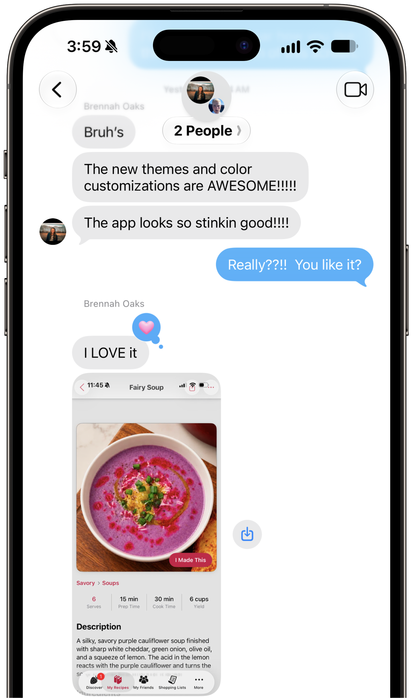
Shortly after installing the new update, she started texting my son Danny (who is one of the Cook'n Elves) and me:
"The new themes and color customizations are AWESOME!!!!!"
"The app looks so stinking good!!!!"
"I LOVE it"
"It all really looks soooo good"
I was thrilled!
But here's what makes this REALLY funny...
SHE HATED IT! 😂
Well...at least she hated it before we built it.
A while back, we started redesigning the screen you see when you open a recipe in Cook'n.
At the time, Cook'n had a very clean, minimalist Recipe View. There was definitely something appealing about its simplicity.
But I felt like we had sacrificed some functionality to get there.
I missed the alternating background colors that make it easier to keep your place in a long ingredient list. I wanted a clearer distinction between the Description, Ingredients, Directions and other parts of the recipe. And, most importantly, I wanted a Recipe View that would be really easy to use while you're actually standing in the kitchen making dinner.
So we mocked up a new design.
I loved it.
Brennah...HATED IT. 😂
And I don't mean:
"Dad, I think I like the other one a little better."
Oh no.
She was ADAMANT!
"Trust me! This is a mistake!"
She loved the Simple Recipe View. She told me not to change it.
Needless to say, we went the rounds over this one.
So I started asking other people what they thought, and something interesting happened.
It seemed like a lot of the younger people I asked gravitated toward the clean, minimalist design Brennah preferred, while many longtime Cook'n users preferred the additional visual organization of my design.
Hmmmm...
So we did what any reasonable software company would do when nobody can agree.
WE BUILT BOTH! 😂
SIMPLE OR DETAILED? YOU DECIDE!
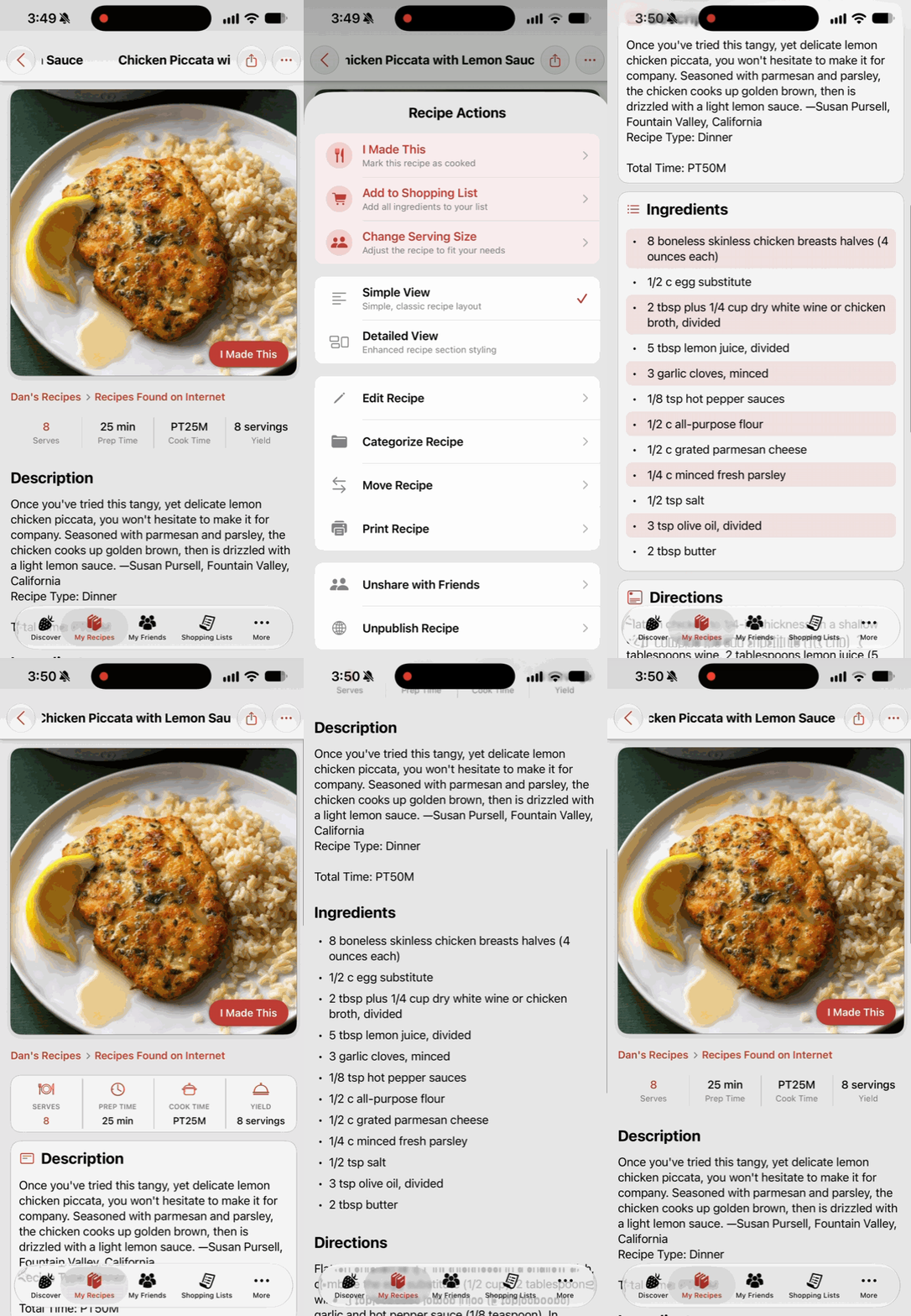
With the new Cook'n update, simply open any recipe...
...tap the More Options button in the top right corner...
...and choose whichever Recipe View YOU prefer:
Simple
or
Detailed
Everybody wins!
Except...
Remember Brennah?
The one who was so adamant that my Detailed Recipe View was a terrible idea?
Well...
After we did all that extra work and gave everyone a choice, she actually started USING the new Detailed view.
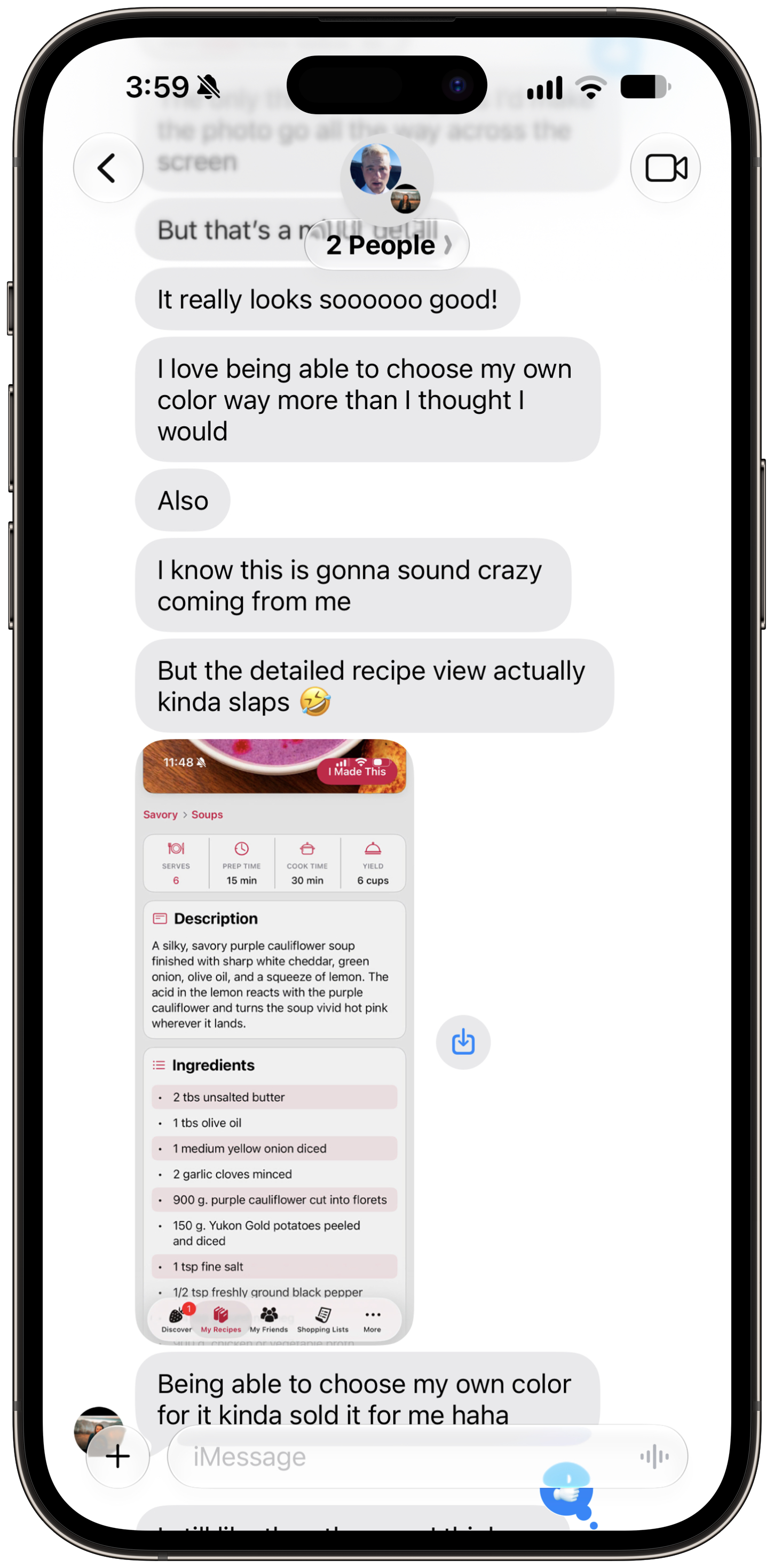
And then I got this text:
"I know this is gonna sound crazy coming from me..."
"But the detailed recipe view actually kinda slaps 🤣"
ARE YOU KIDDING ME?! 😂😂😂
After ALL THAT?!
I couldn't stop laughing.
And then it got even better.
GUESS WHICH ONE SHE'S SHOWING HER FOLLOWERS...
Brennah posts some pretty amazing recipe videos online.
One of her recent recipe videos started taking off, and when she texted me about it, it had already reached 365,000 views!
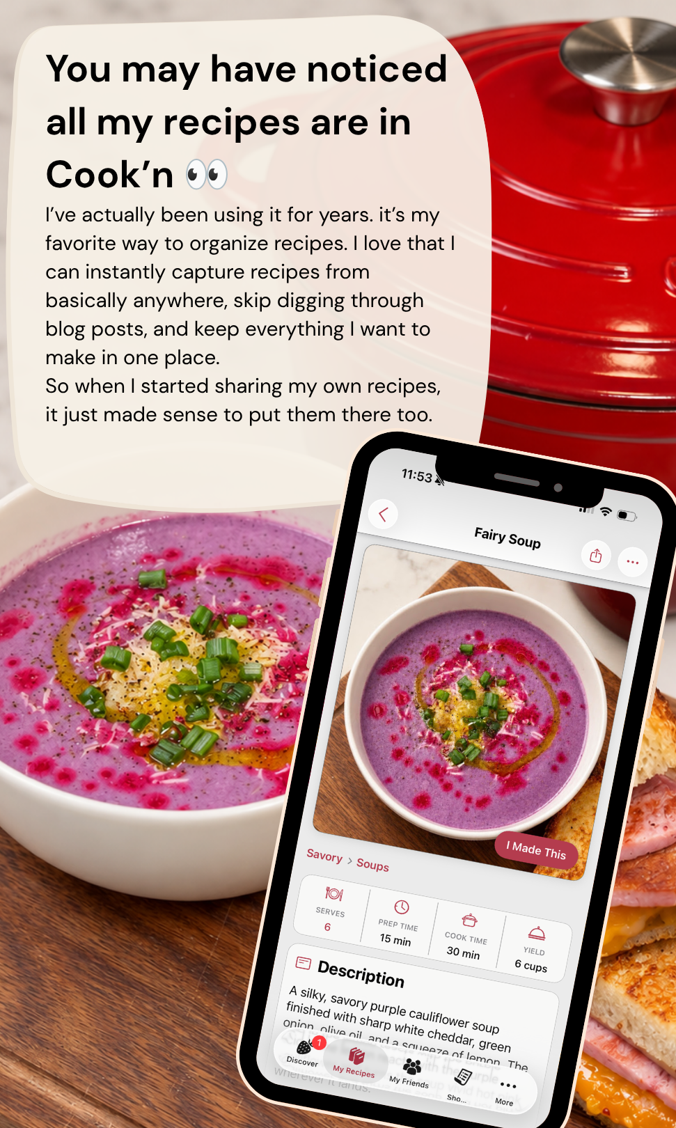
So, while all that traffic was coming in, she decided to post something about Cook'n to her followers.
Here's what she posted:
Notice anything?
THAT'S THE NEW DETAILED RECIPE VIEW! 🤣
I rest my case. 😂
BUT WAIT UNTIL YOU PLAY WITH THE COLORS!
The Recipe View isn't the only thing we changed.
Cook'n now has...
THEMES!
Go to:
More → Settings → Theme
...and you'll find 13 different color schemes to choose from:
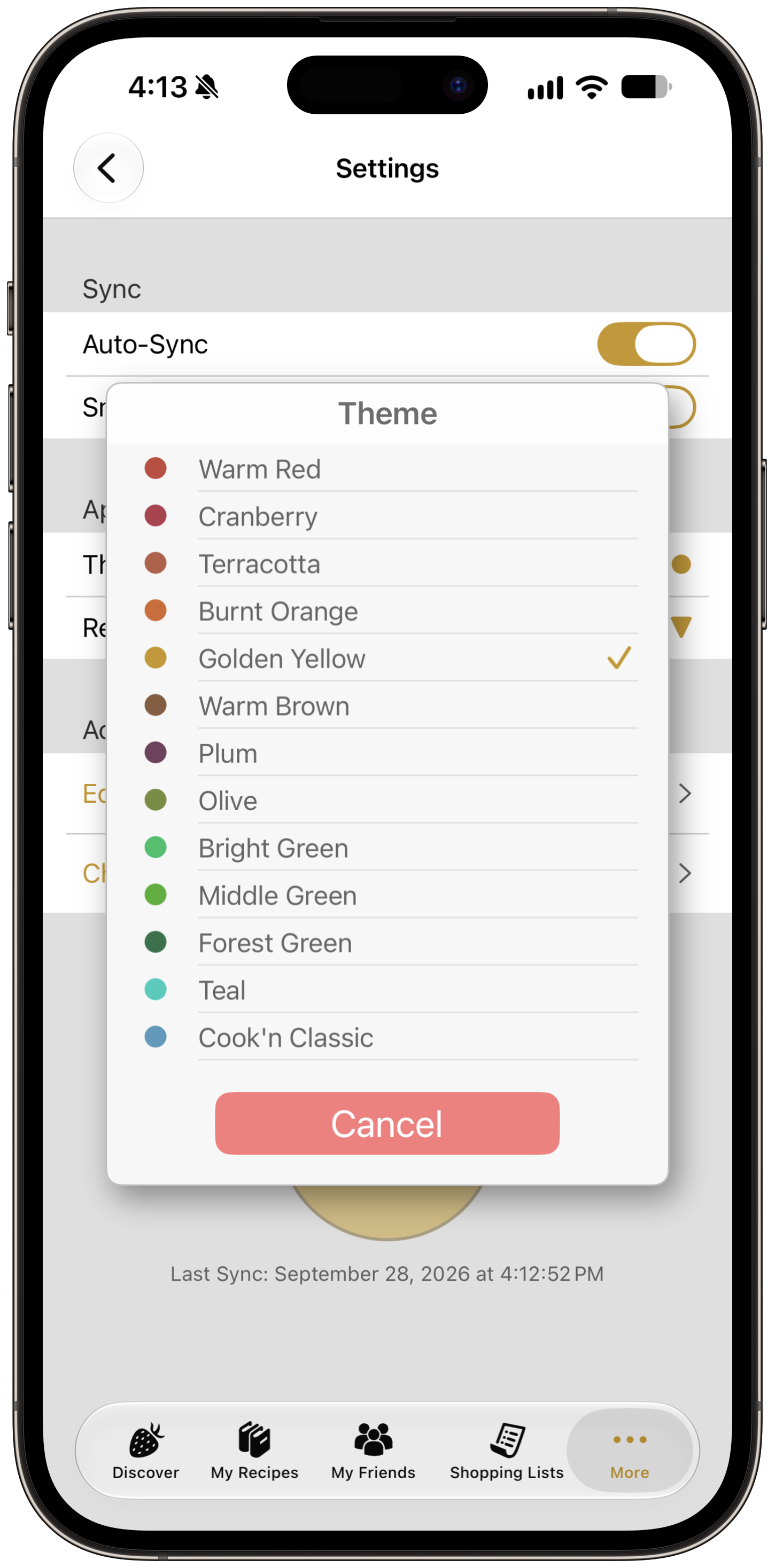
Tap one...
...and the entire Cook'n color scheme changes!
This feature actually came about partly because we couldn't decide which color we liked best! 😂
They all give Cook'n such a different look and feel.
So rather than make the decision for you, we decided to let YOU choose.
We made Warm Red the default because I like it best and it fits nicely with the Cook'n logo and brand colors.
But now you can make your Cook'n look like YOUR Cook'n.
And apparently this was a bigger deal than even Brennah expected.
"I love being able to choose my own color way more than I thought I would."
"Being able to choose my own color for it kinda sold it for me haha."
Even Danny, who did a lot of the UI work on this update, said:
"Honestly, finishing the color feature, and then having to switch branches and work on other features without color changing has SUCKED!!"
😂
Once you've personalized Cook'n with your favorite color, apparently it's hard to go back!
WE DIDN'T STOP THERE!
While we were giving Cook'n a makeover, we added several other improvements too.
SHOPPING LISTS ARE NOW FRONT AND CENTER
We removed My Account from the bottom navigation bar and replaced it with Shopping Lists.

Most of the things that used to be under My Account now live in Settings, while Pinterest Import can be found by tapping the big + button in My Recipes.
I really like this change because having Shopping Lists right there on the main navigation makes Cook'n feel even more like the complete cooking and recipe app it is.
NEW COOKBOOK & CHAPTER BREADCRUMBS
Have you ever found a recipe through Search or a Category and wondered:
"Which cookbook did I put this in?"
Now you don't have to wonder!
Cook'n displays the Cookbook and Chapter right on the Recipe View.

Even better, you can tap the breadcrumb to jump directly to that cookbook or chapter!
TAP THOSE DELICIOUS PHOTOS!
You can now tap recipe photos to enlarge them and see them full screen.
That includes photos inside the recipe directions too!
Sometimes a recipe photo is just too delicious to leave trapped inside that little rectangle. 😂
PHOTOS ARE BACK IN RECIPE DIRECTIONS
Step-by-step photos are once again visible right inside recipe directions.
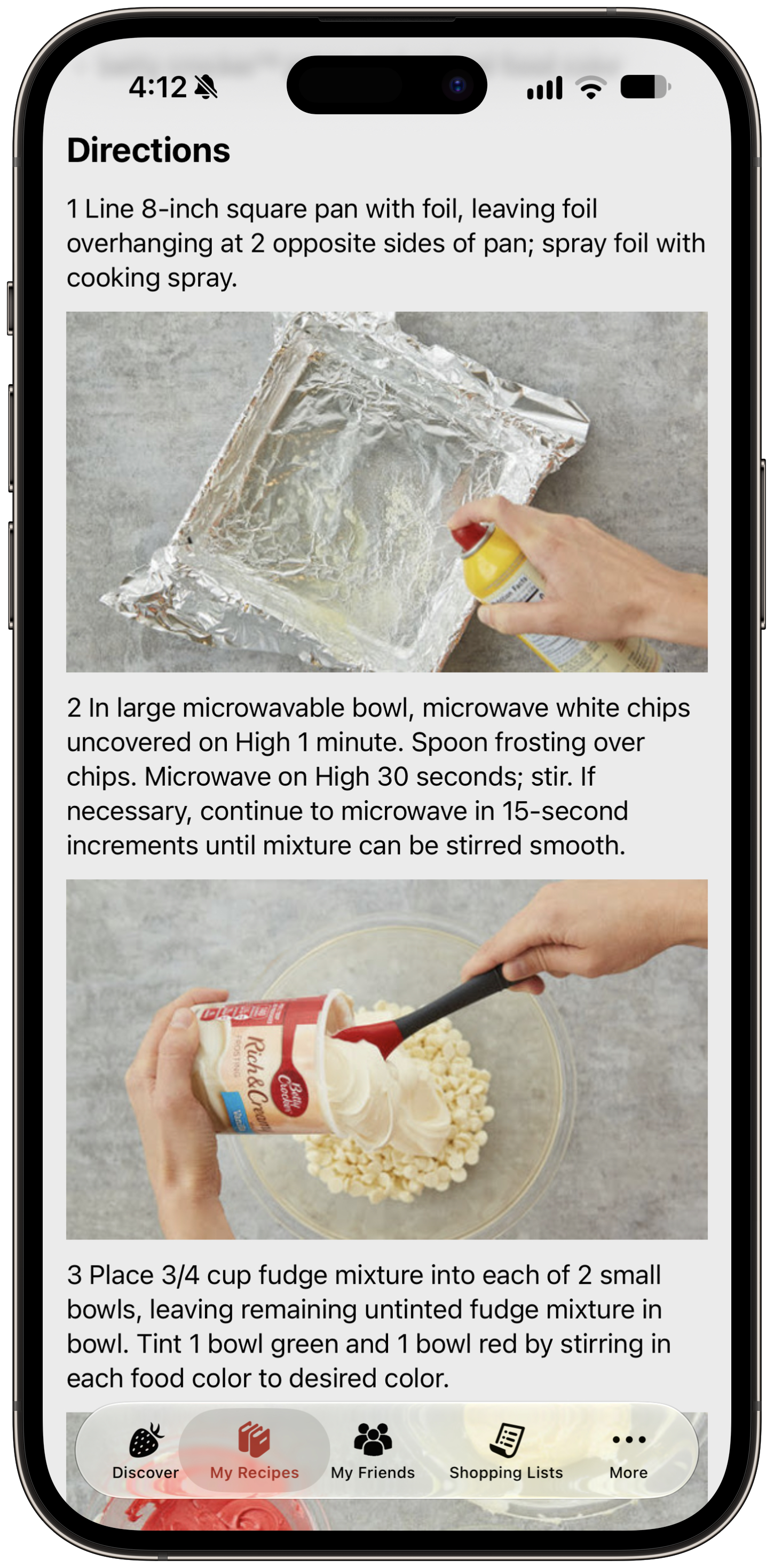
This feature existed previously but was inadvertently removed when we released the new My Recipes view a few weeks ago.
Now it's back!
😴 COOK'N WON'T FALL ASLEEP WHILE YOU'RE COOKING
We've also made sure Cook'n keeps your device awake while using Preview Capture, Recipe Posts, and Made by Me.
Because nobody wants to keep waking up their phone with flour-covered fingers while they're trying to make dinner!
GO CHECK IT OUT!
There are a LOT of little details in this update, but together they make Cook'n feel like a whole new app.
And I absolutely LOVE it!
If you haven't updated Cook'n on your iPhone or iPad yet, go grab the latest version. Then open More → Settings and start playing with the new Theme and Recipe View options.
Try a few different colors. Switch back and forth between Simple and Detailed. Find the combination that feels right to you.
Make Cook'n YOUR Cook'n! 😍
And if you're anything like me, don't be surprised if you find yourself launching Cook'n again later...
...just to look at it. 😂
 Dan Oaks
Founder of DVO Enterprises
Creator of Cook'n
Grandfather of 5. Father of 5. Husband of 1.
Monthly Newsletter Contributor since 2024
Email the author! dan@dvo.com