A Quick Note About the New Toolbar Look in Cook'n 16
I received a thoughtful email this week from Gene P., who asked:
“My Menu bar is gray on gray. Is there somewhere in settings to change it for something with a little contrast?”
Great question, Gene—and I’m glad you asked.
In Cook’n 16, we introduced a fresh new look & feel designed to put the spotlight where it belongs: on your recipes and photos. The updated toolbar uses a more subtle, modern color palette so your food photos really pop and your eyes stay focused on what matters most—finding and cooking great meals.
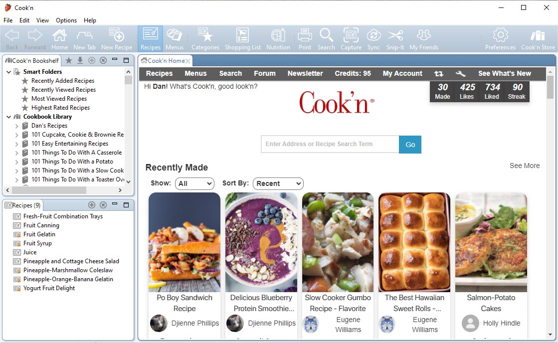
That said, we also know something important after 34 years of building Cook’n:
Everyone cooks a little differently—and everyone sees a little differently too.
If you prefer the more colorful toolbar from earlier versions of Cook’n, the good news is that it’s still there—and always has been.
Want More Color or Contrast? You’re in Control.
You can switch your toolbar appearance anytime. Just click...Options → Customize Appearance
From there, you can choose from 13 different colorful themes, ranging from bold and vibrant to warm and classic. Pick the one that feels best to you.
Some folks love the clean, modern look of Cook’n 16.
Others prefer a bit more color and contrast.
Both are 100% OK—and Cook’n supports both.
Thanks again to Gene for speaking up. Questions like this help us make Cook’n better for everyone.
Happy cooking,
Dan