Changes to Recipe Editor in the Cook'n Desktop App
First I’d like to say, I love the program. Bought it many years ago on a disc and I use it quite a bit. I noticed a change on the last update in the ingredient list where the tools are split right and left where they had previous been all on the right side. It may be just I’m an old man and don’t take change well, but in my humble opinion, if all the tools were still on one side, we could retain precious space in the ingredient list field. Maybe if you could give us the option to drag and drop tools in that field it would be nice to have all the tools in one place. Again, I’d like to say, I love Cook’n and appreciate everybody’s time and energy to improve the app.
ANSWER:
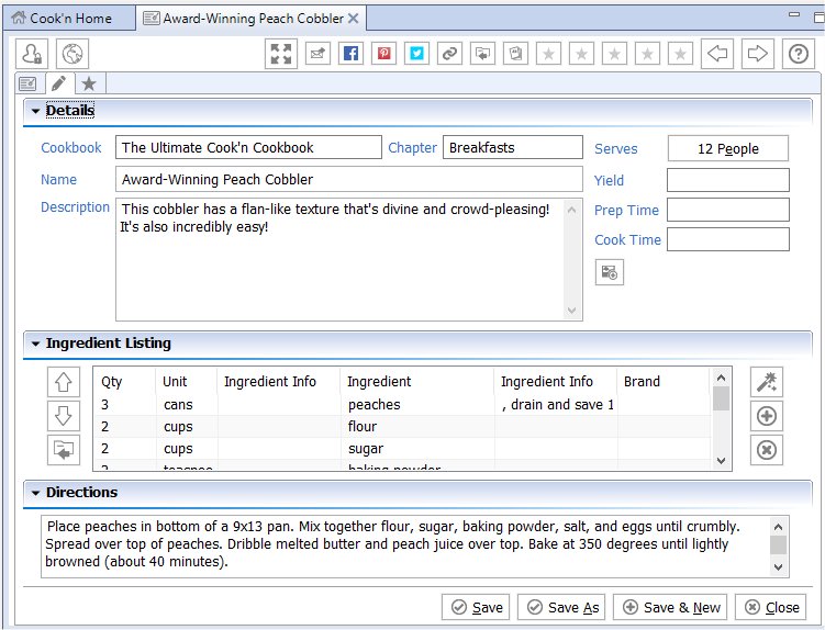
I understand. Personally, I prefer to have all of the tools together on one side as well rather than split up the way they are now. But, the problem is that, if the buttons are all one one side, the minimum height of the Ingredient Listing section is too large.
In other words, if the buttons are all on one side, the height of the Ingredient Listing section cannot be less than the height of those six buttons. For me, this is not an issue because I have a large display. But, According to Statcounter - Web Analytics Made Easy 2, currently, the most common screen resolution is 1920×1080 . Other resolutions in the top five include 1366×768, 1280×1024, 1024×768, and 768×1024.
When the screen height is reduced to 768 pixels which is the viewing area for a high percentage of Cook’n users, the height of the Directions field is reduced to the point that it is almost completely unusable.
By putting some of the buttons on the left side of the Ingredient Listing and some on the right, both the Ingredient Listing section and the Directions section are viewable at the lower resolution.
If you are concerned about the horizontal viewing area in the Ingredient Listing section, please keep in mind that you can resize the columns. Since 99% of the recipes do not use the Brand field, you may want to reduce the width of that field to give yourself more room.
I hope this information helps!